Logo Design
A logo is the most concentrated version of your brand. We design original marks that are simple, memorable, and built to work at any size, from a favicon to a storefront.
What Logo Design involves
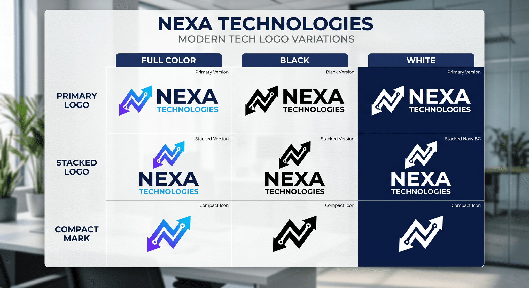
We design a primary logo plus the variations you actually need: stacked and horizontal lockups, a compact mark, and the spacing and color rules that keep it consistent everywhere it goes.
A logo has to do a lot of work in very little space. It needs to read at a glance, survive being shrunk to a favicon or blown up on a wall, and still feel like you in one color or four. We design for those real conditions from the first sketch, so your mark is not just a nice picture but a durable, working asset.
What Logo Design includes
Primary logo and mark
The signature version of your logo, drawn from scratch to be distinctive and instantly yours.
Responsive lockups and variations
Stacked, horizontal, and compact versions so your logo fits every space, from a wide header to a tiny app icon.
Black, white, and color versions
Every variation you need to stay sharp on dark, light, photographic, and printed backgrounds.
Clear-space and usage rules
Simple guidance on spacing, sizing, and what not to do, so your mark always shows up the way it should.
Export-ready files for every use
Organized vector and raster files in the formats developers, printers, and your own team actually need.
Why custom beats a stock mark
We do not pull from templates or stock marks. Every logo is drawn for your brand, then pressure-tested across the real places it has to live.
A logo pulled from a template or a marketplace is, by definition, available to everyone, which means it can never be truly yours. Worse, generic marks tend to fall apart in the real world, breaking down at small sizes or looking ordinary next to sharper competitors. A logo drawn for your brand and tested against real use is the one that still works in five years, which is the only test that matters.
Selected work
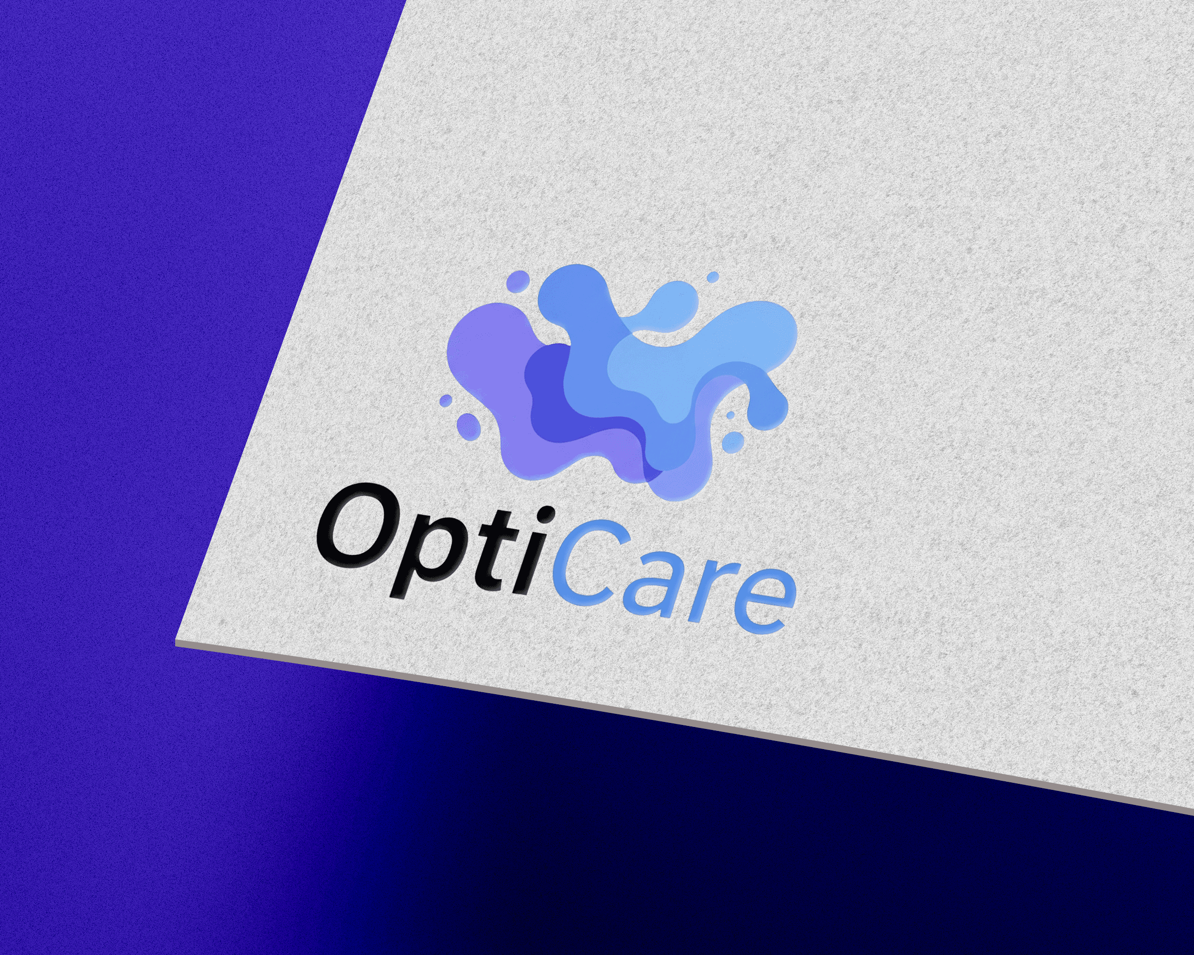
Senior living intelligence demands calm clarity, not noise. Alicorn Ink gave OptiCare a visual language trusted by 100+ facilities to turn complex data into decisive direction.
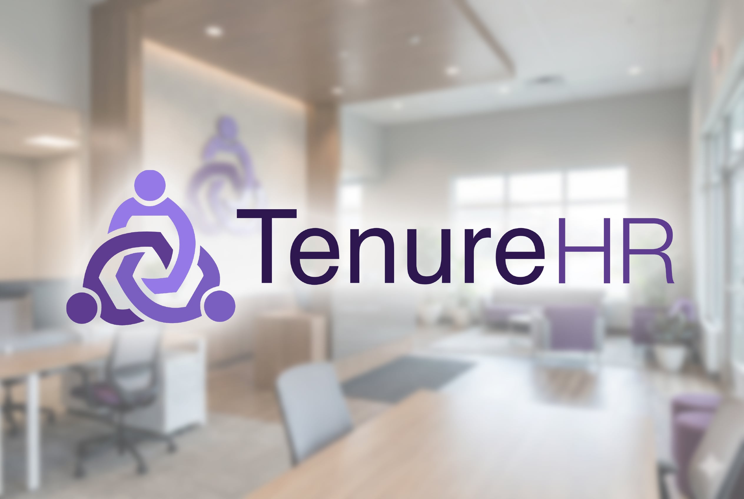
Tenure HR is an AI-powered payroll and HR platform built exclusively for long-term care. Alicorn Ink created their brand, website, and content, turning a complex, deeply technical product into a clear, credible story that LTC operators instantly understand: finally, software built for the way their business actually works.
The mark they drew reads instantly at any size and still feels custom. Our old logo looks like a stock template next to it.
Logo Design FAQs
01How much does a logo cost?
It depends on scope: a single mark is different from a full logo system with multiple lockups and applications. After a short conversation about what you need, we give you a clear, itemized quote.
02What files will I receive?
You get organized vector files (SVG, EPS, PDF) and raster exports (PNG, JPG) in full color, black, and white, plus every lockup variation, ready for print, web, and app use.
03Do you offer logo design on its own?
Yes. A logo can be a standalone project. That said, a logo works hardest as part of a full identity, so we will tell you honestly if your goals call for more than a mark.
04How many concepts do you present?
We focus on a curated set of strong directions rather than a dozen throwaways. We would rather present a few options we genuinely believe in and develop the best one with you.
05Do I own the logo?
Yes. Once the project is complete, the final logo and its files are yours to use however you need.
Explore related services
Brand Identity
Your brand identity is the entire visual system people know you by, not just a logo.
Brand Strategy
Brand strategy is the thinking that comes before the design: who you are, who you are for, and why it matters.
Art Direction
Art direction is the consistent visual point of view that ties your work together.
Ready to Create Something Impossible to Ignore?
Let's talk about your vision. Whether you need strategic brand development, a complete digital overhaul, or a custom creative partnership, we're here to make it happen.
Start a Conversation